How to View the Screen
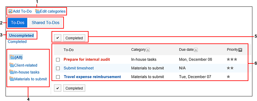
This section describes icons and buttons that are displayed on the To-Do list screen.
"To-Do List (Personal To-Dos)" Screen
The to-do list is displayed.
Fonts applied to To-Do tasks vary depending on the due date.
- To-Dos before due dates and whose due dates are not set: Displayed in blue.
- To-Dos whose due dates are today: Displayed in blue and bold.
- To-Dos past the due date: Displayed in red and bold.

| Number |
Description |
| 1 |
- Link to add To-Do:
Add To-Do.
- Link to set category:
Set categories.
|
| 2 |
- "(Personal) To-Dos" button:
The added To-Dos are displayed.
- "Shared To-Dos" button:
The To-Dos assigned to you in the space you are participating are displayed.
|
| 3 |
- "Unprocessed" link:
The uncompleted To-Dos are displayed.
- "Completed" link:
The completed To-Dos are displayed.
|
| 4 |
Category:
Category in the To-Do list. |
| 5 |
- Button for selecting checkboxes:
Click to select all checkboxes. The checkboxes are cleared when you click it again.
- Finish button:
Changes the statuses of the To-Do tasks that you have selected using the checkboxes to Completed.
|
| 6 |
To-Do List:
- To-Do name link:
When clicked, the following screens are displayed
- For personal To-Do:
To-Do List details screen
- For shared To-Do:
To-Do Details Screen
For details on shared To-Dos, refer to Adding a shared To-Do of Space.
- Due Date:
The due dates for the To-Do tasks.
- Importance:
The importance of the To-Do list is displayed as a star.
|
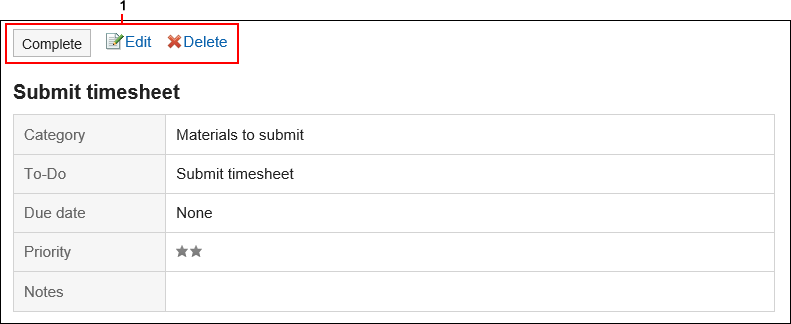
"To-Do List Details" Screen
This section describes how to view the "To-Do List details" screen.

| Number |
Description |
| 1 |
- Finish button:
Complete the To-Do task.
- "Change" link:
Edits the contents of unprocessed To-Do. This link is disabled for completed To-Dos.
- "Delete" link:
Deletes the To-Dos.
|

