Multi-choice
Placing a Multi-choice field on your app form creates a field that lets users select one or more options from a predefined list.
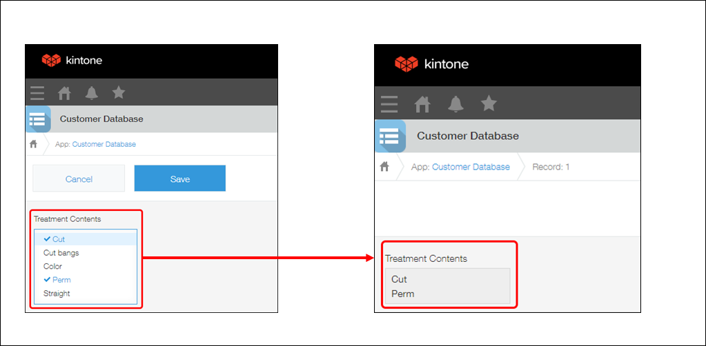
Multi-choice field options are displayed in vertical format on the New record and Edit record screens. A scroll bar is added when there are many options.
Only the options that have been selected are displayed on the Record details screen.

Field settings

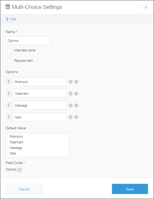
Name
Specify the field name. The field name is displayed as the label of the field in the app.
Hide field name
Select this option to hide the field name on the following screens.
- The New record screen
- The Edit record screen
- The Record details screen
- The screen for printing a record
- The app form settings screen
Required field
Select this option to make choosing a field value mandatory.
Options
Enter the field options. You can add up to 1,000 options, with up to 128 half-width or full-width characters for each option.
Add an option by clicking the plus sign-shaped Add icon to the right of an option input field, or by pressing the Enter key when the last option input field listed is selected.
Remove an option by clicking the minus sign-shaped Delete icon to the right of the option input field.
Change the order of an option by dragging and dropping the arrow icon to the left of the option input field.
Default value
Specify options to be selected by default.
Field code
This is the code used for specifying the field in formulas or APIs.
Usage examples
Use Multi-choice fields when you want to make it possible to select one or more options from a list.
Multi-choice fields are displayed on the New record or Edit record screen with the same size, no matter how many options there are. For this reason, you may want to use a Multi-choice field if there are too many options and a Check box field would take up too much space.
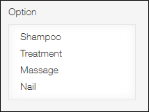
As one example, you can use a Multi-choice field in a customer management app to register which services customers chose.

